From Visual Capitalist
See this visualization first on the Voronoi app.
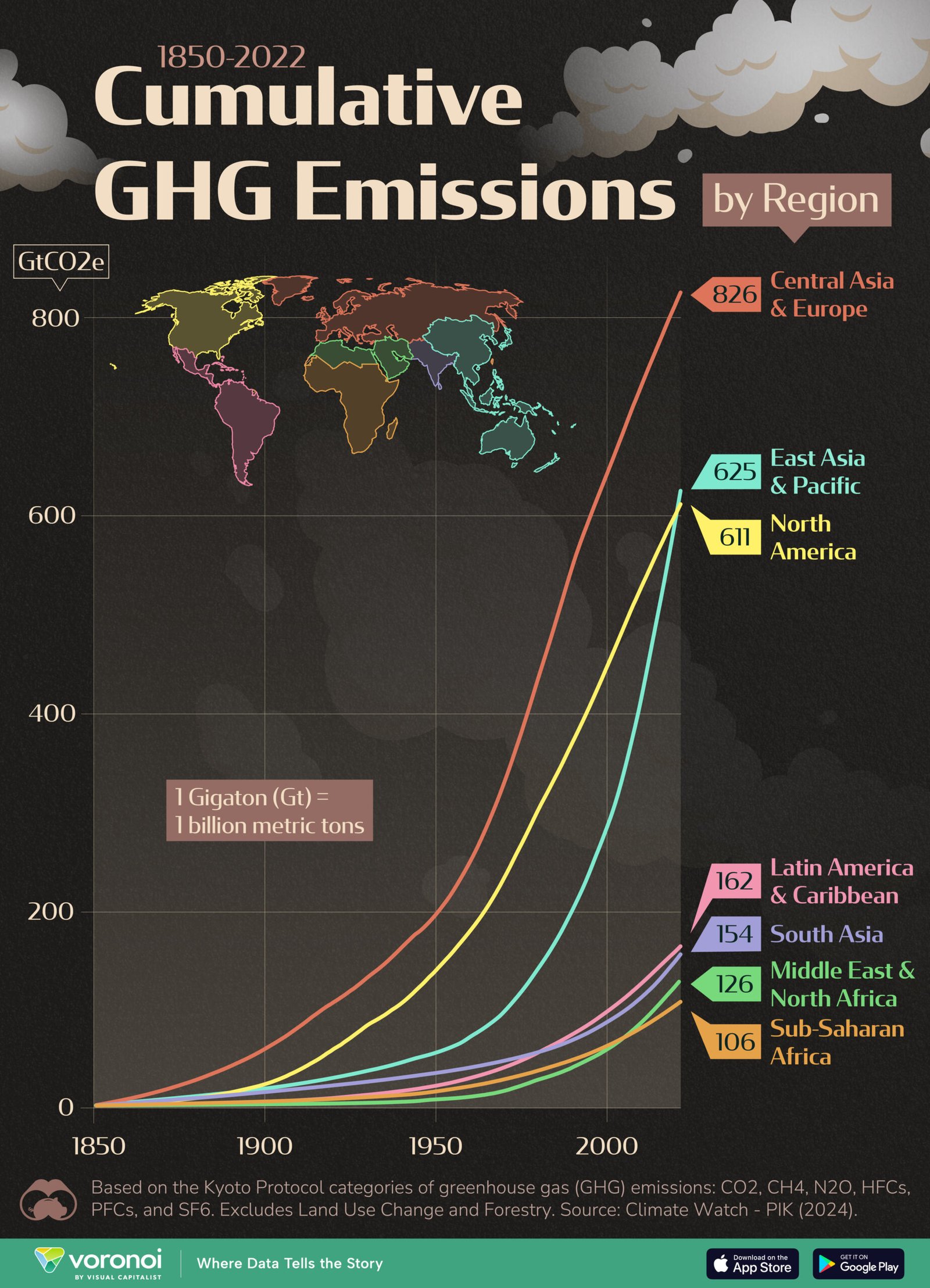
Visualizing 170 Years of Cumulative GHG Emissions
This was originally posted on our Voronoi app. Download the app for free on iOS or Android and discover incredible data-driven charts from a variety of trusted sources.
In this graphic, we provide a unique perspective on global climate emissions by visualizing cumulative GHG emissions by region, from 1850 to 2022.
All figures were sourced from Climate Watch (PIK PRIMAP-hist dataset), and are represented in gigatons of CO₂ equivalent. One gigaton is equal to one billion metric tons.
Data and Key Takeaways
[...]
Read the full post at Visual Capitalist.